The Unity team, with their latest release of Unity 2021.2, has introduced a slew of improvements to the (relatively new) 2D Rendering Pipeline. If you aren’t familiar yet with the 2D Renderer, it comes with a particularly compelling feature, 2D Lighting, which we can use to performantly light a 2D scene with many simultaneous lights at a time.
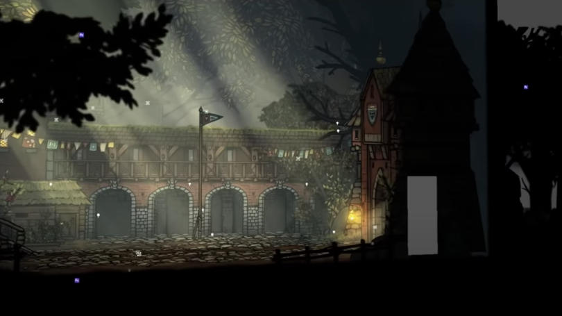
New in Unity 2021.2 is the introduction of Custom 2D lighting, via the Sprite Custom Lit shader for Shader Graph. It behaves similarly to the normal 2D Lit shader (which lights sprites with realistic, physical calculations), however, it allows us to directly control how the lighting of the scene is applied to our sprites and textures. This opens up quite a few possibilities for us to change the look of our games via the lighting system.
With this tutorial, we’ll introduce a scaled-down version of the above shader, that hopefully ends up being a helpful base to stack on more advanced lighting effects later down the line. This tutorial will assume at least some familiarity with Unity’s Shader Graph, as well as with basic shader concepts.
Let’s start by creating a new project in 2021.2, using 2D (URP) as the Project Template. This will set up a new project with an already-configured URP Renderer and 2D Rendering Pipeline for us.
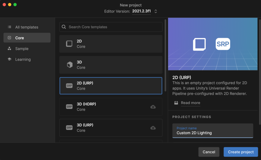
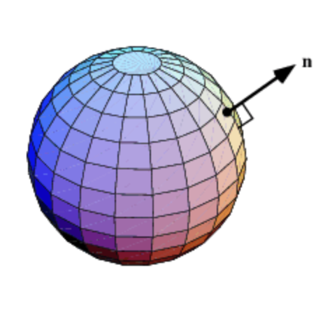
After hitting “Create project”, download the archive below and add sphere.png and sphere-normal.png to the project. This will give us a plain circle sprite, and a corresponding Normal map that’s been generated from a sphere, that’ll let us map 3D information onto the main circle inside of our shaders. This tutorial will assume familiarity with Normal maps, but if they’re a concept that you need to brush up on, here is a decent series that explains them at a fairly informal level.
Note: the tutorial above is for geometry in 3D space, however, it is still applicable for us in 2D as well, as all of the sprites we use are simply 3D quads that have been arranged onto a 2D plane. From a geometry standpoint, there are practically no differences in this respect between 3D Unity scenes and “2D” Unity scenes.
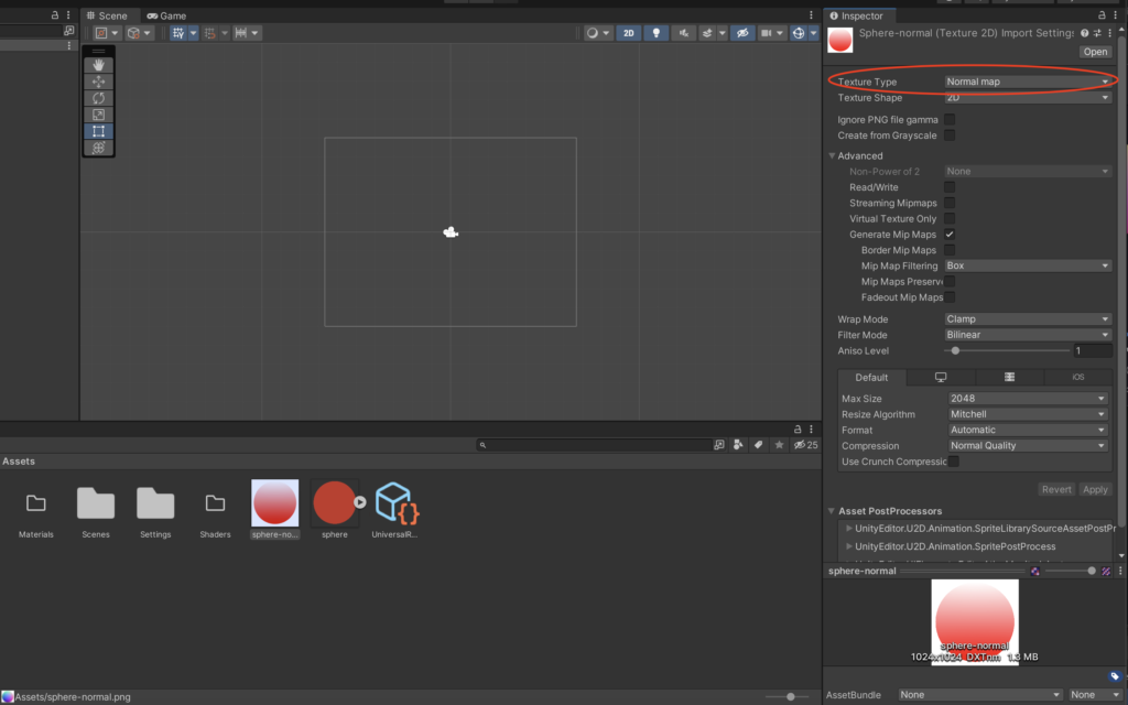
Once the files are in the project, select sphere-normal.png and, under its import settings, set Texture Type to Normal map. This lets Unity know that the texture contains Normal-space information.
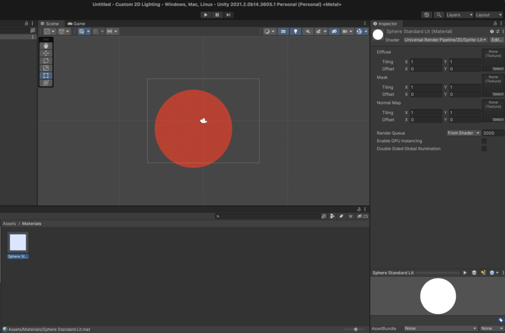
To illustrate how lighting works with the default lit shader, let’s create a new material with the default Sprite Lit 2D shader. Additionally, assign the Normal Map texture in the material to sphere-normal.png. We’ll use this material to sanity-check that basic lighting is working in our scene as expected.
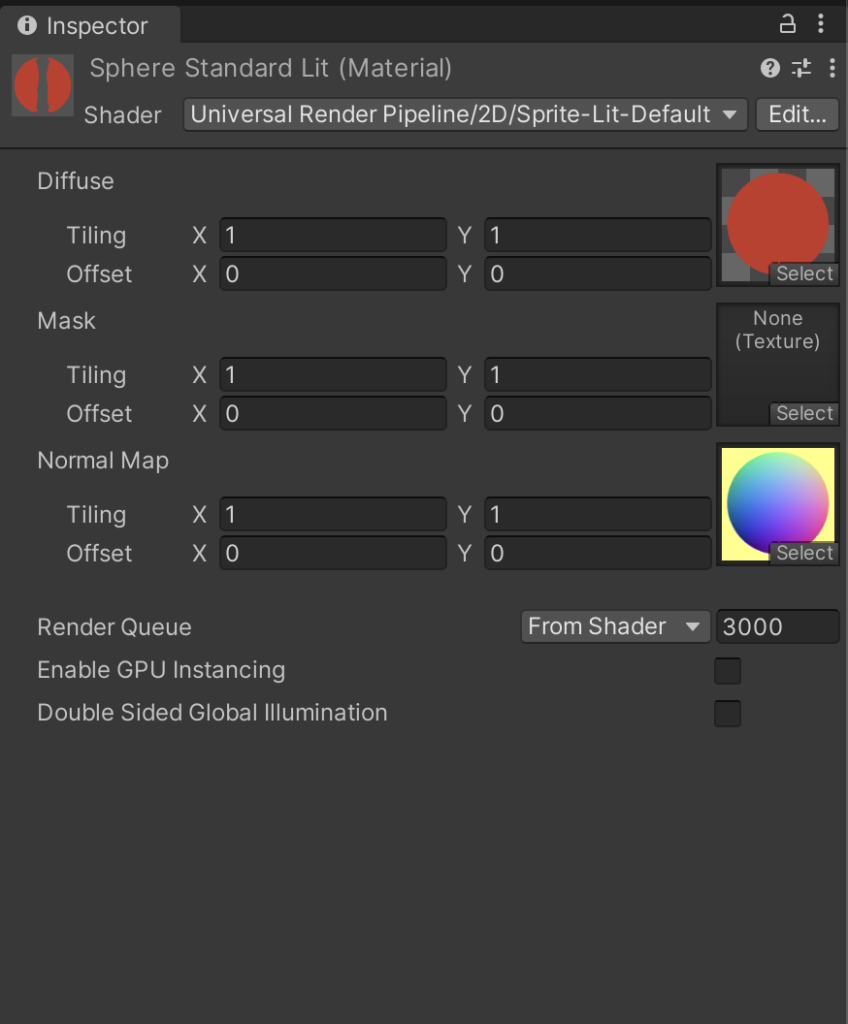
Our next step after setting up this material is to open up the default scene that’s included in the default 2D Template. We’ll do the rest of the tutorial within this scene.

Place the sphere.png sprite into the scene, assign our material to it, and then give the Global Light in the scene a cool, dark color. The sphere should then darken.
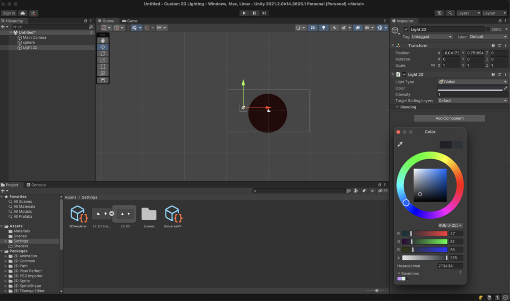
We should be able to light the sphere now via 2D Lighting. Place a 2D Spot Light into the scene and then position it near the sphere. At first, the light should bounce onto the sphere as if it were a flat circle. This is because we need to change the Normal Maps setting of the light to Accurate. Once we do that, the light will respect the Normal information on the sphere’s material, and will light it as if it were a “3D” object.
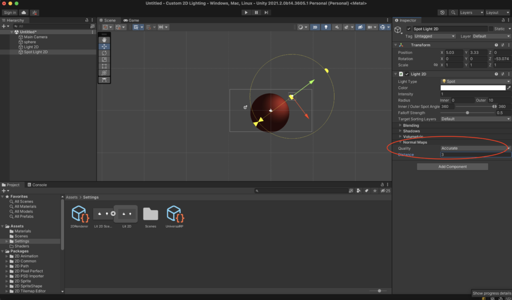
We’re fully set up at this point, and can now start deviating from the default Sprite Lit shader by introducing a new, custom shader into our project. Our goal will be to switch from the default shader’s realistic shading to a more stylized, two-tone Toon shader. The hope here is to build a more fitting aesthetic for certain styles of games.
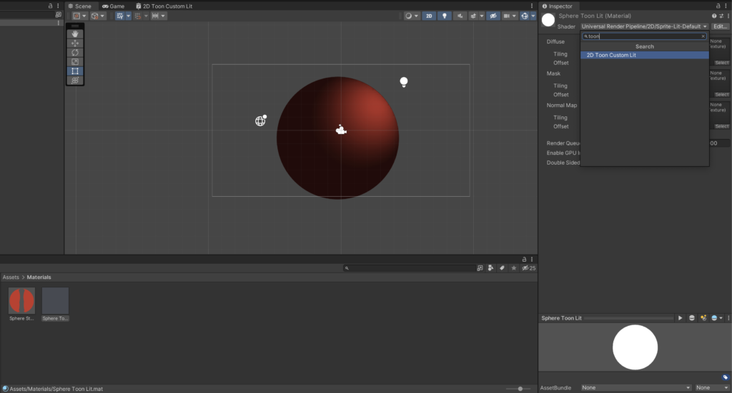
Create a new Sprite Custom Lit Shader Graph (we’ll name it 2D Toon Custom Lit in our project), and then open it to put us into the graph editor.

If you’ve used the Sprite Lit Shader Graph in the past, you’ll notice that the Custom Lit graph looks almost identical. The only immediately observable difference from the interface is the addition of the Normal (Tangent Space) output to the Fragment Shader portion.
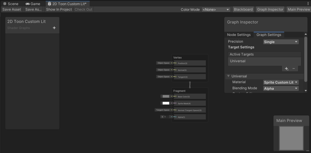
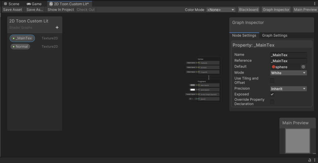
First, let’s create a few inputs for our shader. On the left, inside of the Blackboard pane, create a _MainTex and a Normal Texture2D input. We’ll use these to feed in our sprite and its corresponding normal, in the same manner that we did with the Sprite Lit material.
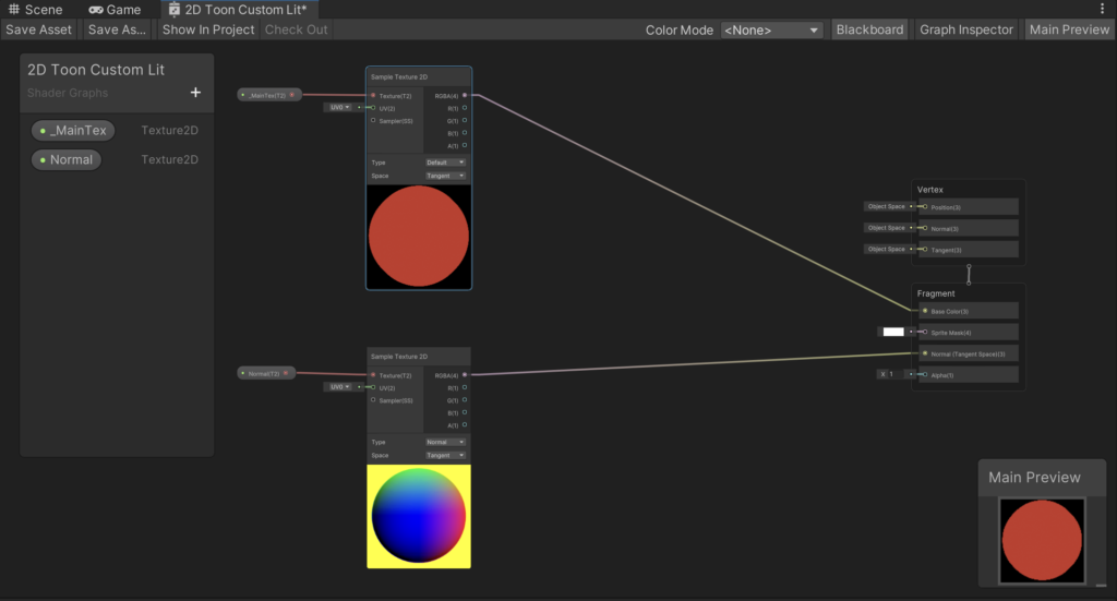
Now let’s connect up our inputs. Create two Sample Texture 2D Nodes, input _MainTex and Normal into their Texture slots, and then feed the _MainTex texture into the BaseColor slot of the Fragment output, and the Normal texture into the Normal (Tangent Space) output. As the Normal output implies, make sure that the Sample Texture 2D node for the Normal texture is set to Type → Normal and Space → Tangent. Hit “Save Asset” in the top left.
We can test the shader in our scene now so we can see how it differs from the Standard Lit shader.
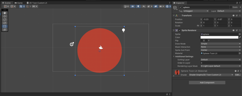
You’ll notice immediately that our new material is “unlit”. This is expected and is the main difference between the Custom Lit shading path and the Standard path. In the custom shader, we’ll have to apply the lighting ourselves, whereas the Standard Lit shader applies lighting automatically as a separate phase after the main shader runs.
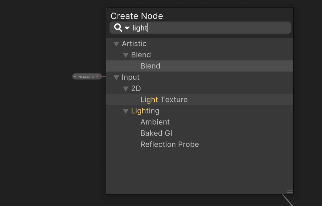
Thankfully, this isn’t too hard to do. The Custom Lit shader exposes a new Node for us, called Light Texture. This node contains the scene’s intermediary lighting information, in the form of a screen-space texture. Conveniently, it respects the Normal information that we’ve outputted to the Normal (Tangent Space) slot, so all of the standard lighting calculations are still handled by the renderer for us.
Let’s add a Light Texture node to our Shader Graph.
Create another Sample Texture 2D Node, feed our 2D Light Texture into it, and then we’ll multiply the light texture by the Main Texture of our sprite. Feed this into the Base Color output, and then hit Save Asset so we can check out what happens to our scene.
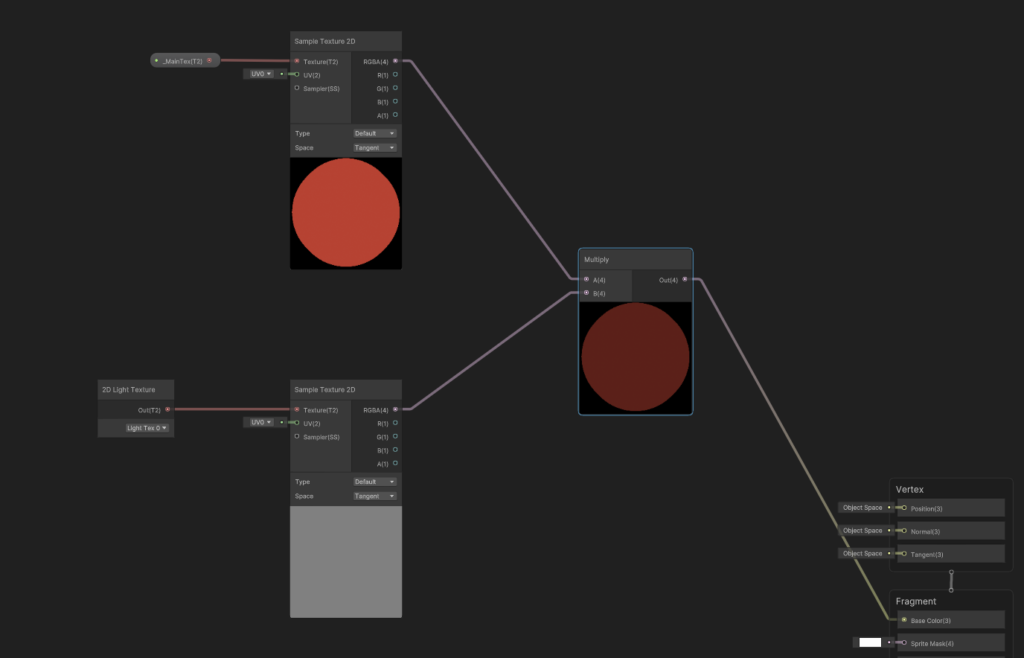
You’ll notice a strange result. There is some lighting info projected onto the sphere, but it’s distorted and centered onto only a small part of the sphere.
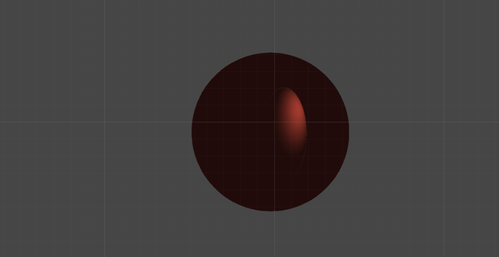
The reason for this is that the 2D Light Texture that we’re sampling contains the lighting texture for the whole screen, and not just the object that we’re applying the shader to. We’re actually projecting the entire screen onto the sphere in our current implementation, but thankfully this is an easy fix.
Let’s go back to the graph so we can feed in screen-space UV coordinates to our Light Texture’s Sample Texture 2D node. Screen Position is a handy node that converts the object’s current UV coordinates into screen-space coordinates, letting us sample only from the portion of the light texture that the object is currently positioned in.
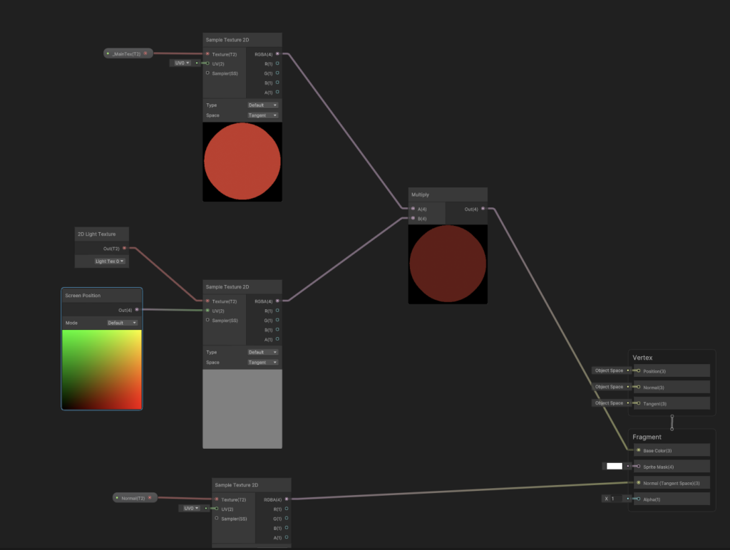
Let’s check out our sphere now.
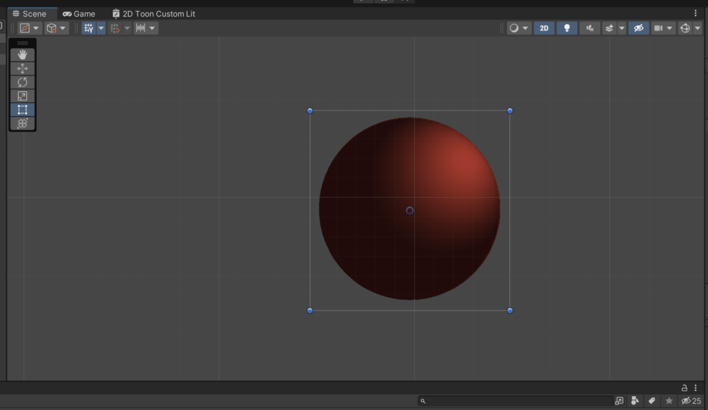
Looking good! We’ve successfully replicated (most) of the Standard Lit shader with our Custom Lit shader. From here, we can start applying some techniques to give us a more stylized lighting projection, as opposed to the simple multiplying of the light texture that we’re doing currently.
The main idea behind a “Toon” shader is to split the light into two “tones” (a light and a dark tone), and then, instead of lighting an object with a smooth gradient between the two tones as we’re doing above, the toon shader will apply the light using a sharp, immediate step between the tones. This is what gives lighting a more cell-shaded look.
We’ll introduce two more nodes to the graph. The Gradient node, and the Sample Gradient node. Sample Gradient takes two inputs: the first, a Gradient of color information, and the second, a Time value from [0, 1] that maps into the gradient (a value of 0 will take the color at the left-most side of the gradient, and a value of 1 will take the right-most value. Values in-between will select a corresponding intermediary value.)
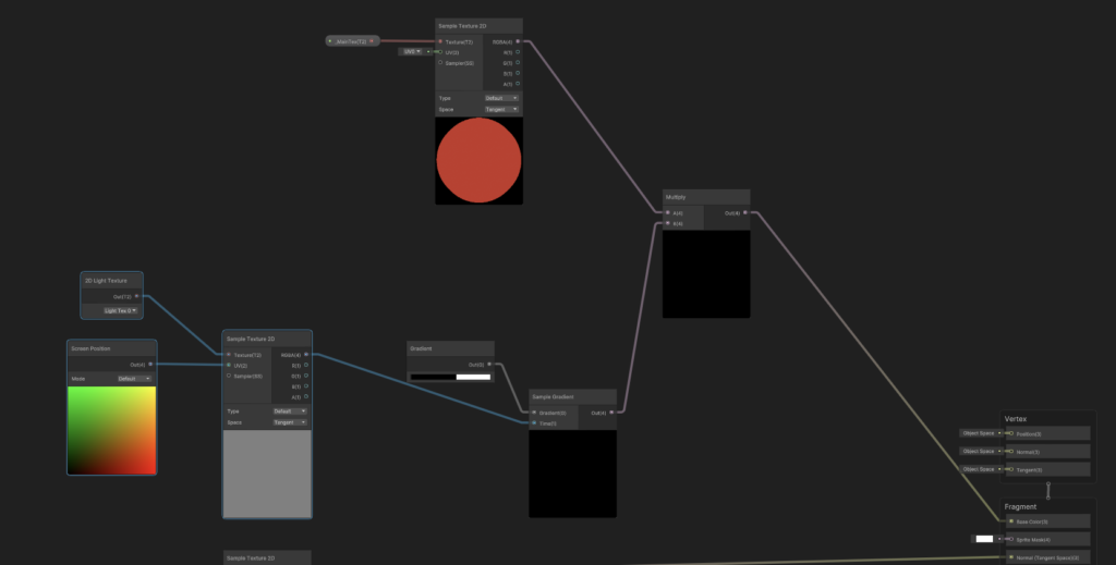
Select the color bar on the Gradient Node, switch the mode from Blend to Fixed, and then give the gradient a black value on the left, and a white value on the right, cut roughly down the middle.
Multiply the output by our Main texture, hit Save Asset, and then check the result in our scene.
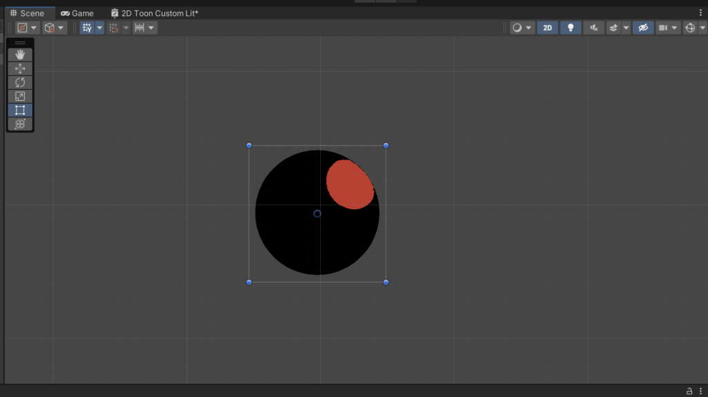
We’ll notice that the sphere is being lit by two tones, and in a way that we can expect from our operations in the graph. Values more towards the light (and closer to a value of 1), are being multiplied by the right side of the gradient, which is a value of 1. Thus, they’re left unchanged from the original texture.
Likewise, values further away from the light (and closer to a value of 0) are being multiplied by the left side of the gradient, or by the value 0, and become completely black.
Here’s an illustration of the Gradient map, sans any multiplying to the base color of the main texture.
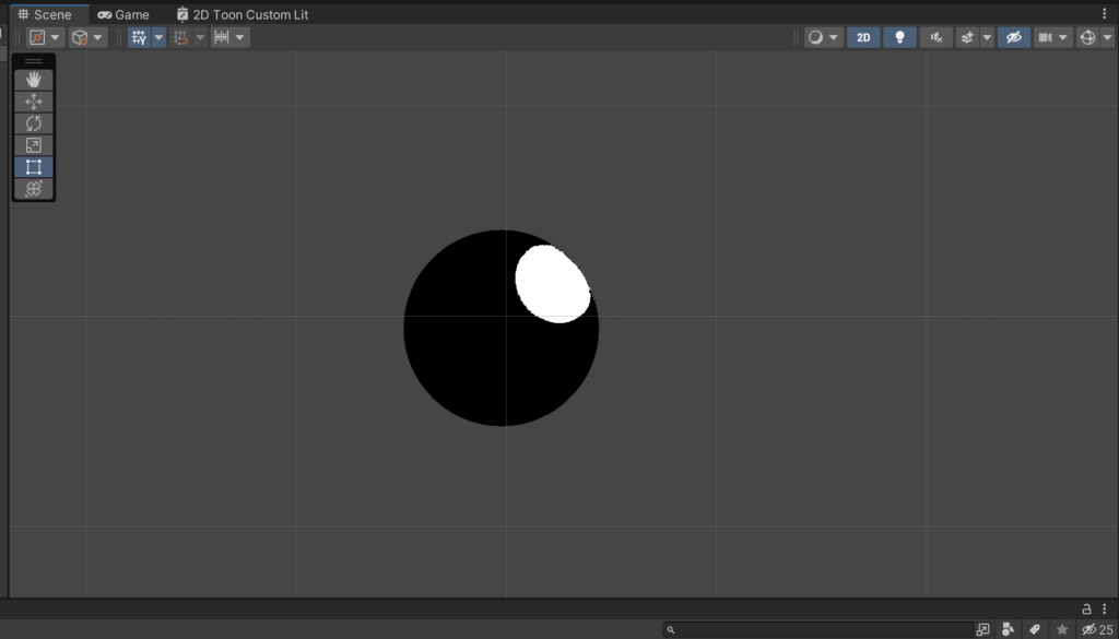
Our goal now is going to be to reduce the contrast of this gradient map, giving us a less intense transition between the regions in shadow and the regions in light. There are a few ways to do this:
- We could control the colors of our Sample Gradient directly, giving a lighter color to the shadow.
- Or, we could introduce a “Shadow Strength” parameter that lessens the strength of the black portion of the gradient during our multiplication step.
- More complicated yet, we could introduce a new parameter, Influence, and then using a standard Mix formula to apply the black and white lighting information to the texture’s base color according to how strong we want the influence of the black and white gradient to be.
All of these are perfectly workable solutions — for the sake of introducing a new concept, we’ll go with the Mix option, even if it’s slightly more complicated. If anything, it’s a new formula that you might find useful for other applications.
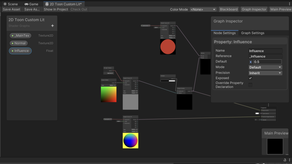
The generic formula for mixing two colors based on an Influence parameter is as follows: ((1 – Influence) * A) + (A * B * Influence). Let’s set this up in the Graph, as shown below.
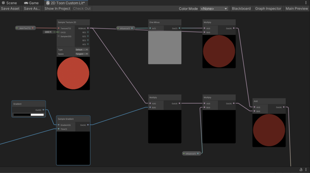
Finally, connect the result to the Base Color output, hit Save Asset (for the last time), and then check out the sphere.
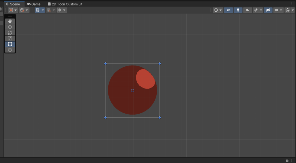
Looking pretty good! Definitely a different style from the Standard Lit shader, and we can be pretty happy with the result. It’s important to note that this approach does come with some drawbacks, however:
- We lose color information from the light (because we’re only applying a black and white gradient to the sphere). There are techniques to re-introduce color information, like extracting Hue from the light texture. These work to varying degrees of success.
- This works best if every lit object in a scene has a Normal map texture, which can increase our workload when creating assets
- We do get some aliasing between the two tones. There are techniques to fix this, but they’re beyond the scope of this tutorial
That being said, this base shader is still quite powerful on its own.
I’m attaching the Graph below, please feel free to use it for your own projects if you think you could make use of it!


